Do you crave a cozy retreat space? Your bathroom can be the perfect place.. Whether you’re drawn to soft whites, spa-inspired colors, or something bold and moody, paint plays a major role in creating the look and feel of the space. If you’re feeling unsure how to choose a color that actually works with your layout, lighting, and finishes, you’re not alone.
At Custom Built, we help Michigan homeowners craft gorgeous and functional bathroom remodels.
This guide walks you through our top eight bathroom paint color families. For each, we’ll explain why they work, where they work best, how not to use them, and our favorite Sherwin-Williams options:
- Soft White
- Warm Neutral
- Cool Gray
- Spa-Inspired Blue
- Muted Green
- Dramatic Dark
- Dusty Rose
- Light Terracotta
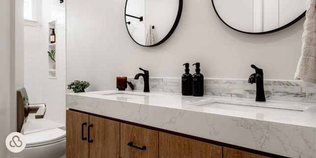
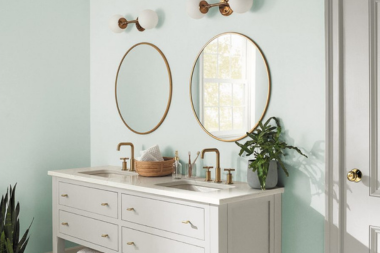
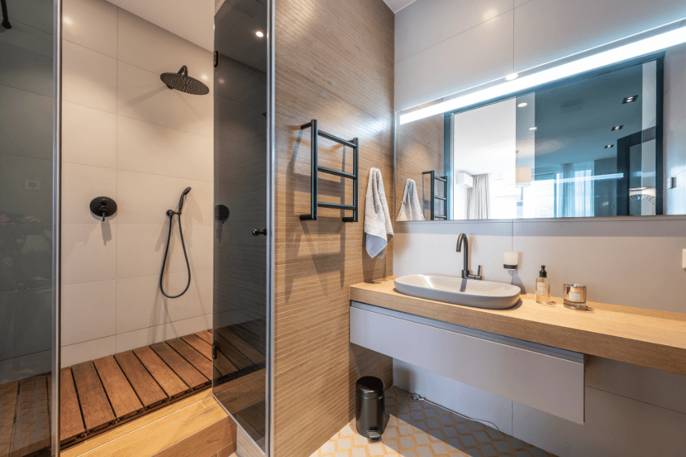
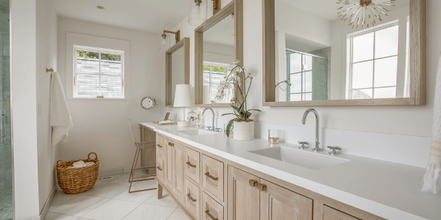
1. Soft White
PC: Sherwin-Williams
Soft white is one of the most flexible bathroom colors. It reflects light, making a small space feel larger or a window-filled bathroom feel even brighter. In rooms with minimal lighting, it can enhance brightness without the need for additional recessed lighting.
Best for:
Small bathrooms, low-light spaces, homes with windows in the bathroom.
How Not to Use It:
Avoid pairing soft white with cold, clinical finishes like stark chrome or bright white tile without texture. This combination can make the room feel sterile rather than refreshing. Instead, warm it up with textured tile, wood tones, or soft metals like brushed nickel.
Our Favorite Soft Whites:
- Alabaster (SW 7008)
- Shoji White (SW 7042)
- Westhighland White (SW 7566)
- Whitetail (SW 7103)
- Creamy (SW 7012)
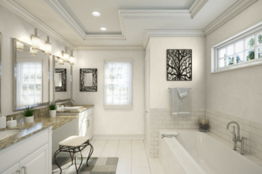
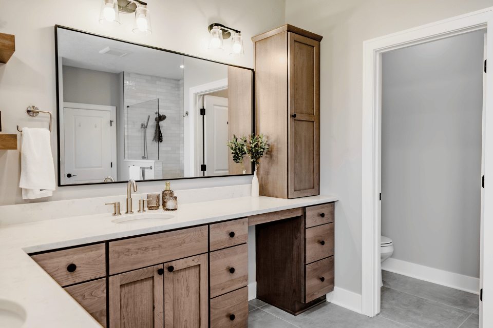
2. Warm Neutral
PC: Sherwin-Williams
Warm neutrals include taupe and beige shades. They add depth and a traditional feel to a bathroom, especially when paired with white tubs or marble tile. These tones can help create cozy contrast and add character without making the room too dark.
Best for:
Primary bathrooms, traditional design styles, spaces with light-colored tile or stone.
How Not to Use It:
Skip warm neutrals in tight or windowless bathrooms. Without natural light, they can appear muddy or make the room feel smaller. Also, avoid using overly red or orange undertones that may clash with cooler materials like stainless steel or gray tile.
Our Favorite Warm Neutrals:
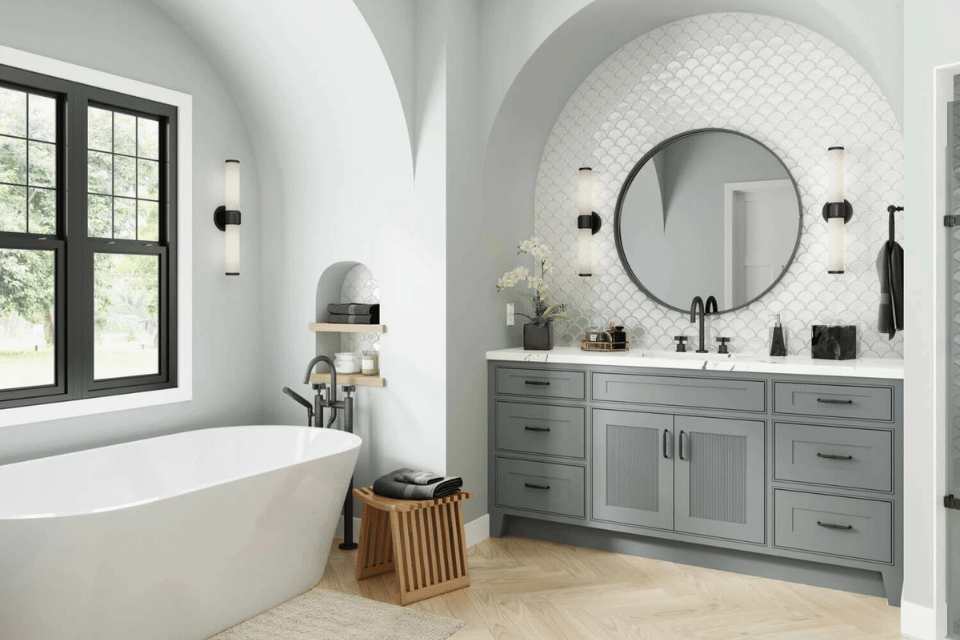
3. Cool Gray
Cool grays are incredibly versatile and remain popular for a reason. They work with many styles, from farmhouse to modern. Depending on your preference, you can select warmer “greige” (a blend of gray and beige) tones or cooler silvers. Grays also pair well with black hardware, white countertops, and blue accents.
Best for:
Any bathroom style, homeowners focused on resale, spa-inspired spaces.
How Not to Use It:
Avoid choosing a gray that is too cool and flat. In low-light bathrooms, it can make the space feel cold or shadowy. Be mindful of clashing undertones in tile or stone. A gray with blue undertones can look off next to brown-toned flooring.
Our Favorite Cool Grays:
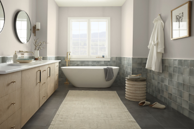
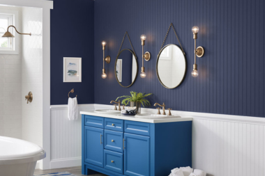
4. Spa-Inspired Blue
PC: Sherwin-Williams
Spa-inspired blues bring a calming, retreat-like feeling to the room. Deeper navies give elegance, while mid-tone sea-glass blues create a peaceful, airy look. They work well with white fixtures, natural materials, and simple accent lighting.
Best for:
Lake houses, guest bathrooms, homes near the water, relaxing primary bathrooms.
How Not to Use It:
Avoid overly bright or baby blues. Colors that resemble cotton candy or Easter eggs can make the space feel dated or overly playful, rather than spa-like. If your space features a lot of marble, be cautious of blue undertones that may compete with the veining.
Our Favorite Spa-Inspired Blues:
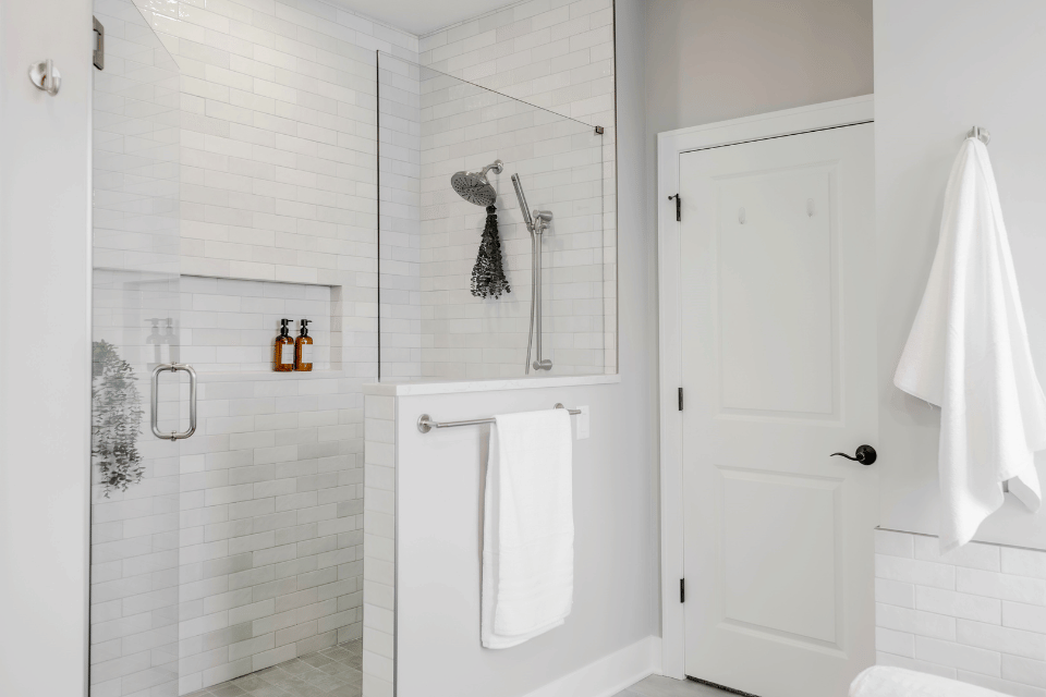
5. Muted Green
PC: Livingetc
Muted greens like Sherwin-Williams Dried Thyme offer a soft, earthy palette that feels both timeless and modern. This color works well on walls, trim, and ceilings to create a unified, serene look. It pairs beautifully with wood vanities, marble tile, or brushed gold fixtures.
Best for:
Nature-inspired bathrooms, color-drenched designs, calm and balanced layouts.
How Not to Use It:
Don’t use this color in a space with a lot of bold, modern elements. Bright chrome, glossy tile, or high-gloss white may not complement muted greens. Avoid overly yellow or neon green tones, as they can shift the color into a different, less calming category.
Our Favorite Muted Greens:
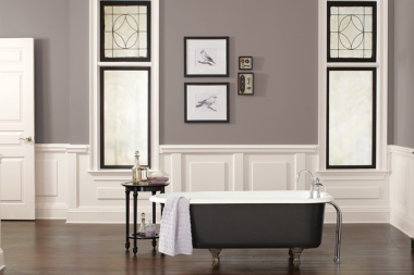
6. Dramatic Dark
PC: Sherwin-Williams
Deep navy, charcoal, or forest green can create a dramatic, intimate space. When paired with gold hardware or natural wood tones, these colors add instant elegance. They’re ideal for smaller bathrooms that require a bold, memorable look.
Best for:
Powder rooms, statement walls, elegant and moody designs.
How Not to Use It:
Avoid using dark colors in full primary bathrooms unless there is plenty of natural light. These colors can feel heavy and close in the space. Stay away from dark reds or purples that can make the bathroom feel dated or overly dramatic.
Our Favorite Dramatic Darks:
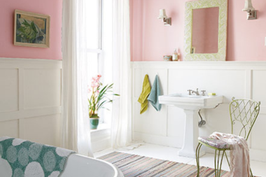
7. Dusty Rose
PC: Sherwin-Williams
Dusty rose brings softness and charm to a bathroom, offering a subtle hint of color that doesn't overwhelm the space. Its muted pink undertone creates a warm, welcoming atmosphere and can lean playful, elegant, or vintage depending on how it’s styled.
Best For:
Guest bathrooms, powder rooms, kids' bathrooms, or coastal-inspired spaces with brass or floral accents.
How Not to Use It:
Avoid pairing dusty rose with too many dark or heavy elements, as it can start to feel overly sweet or outdated. It's also best used in smaller doses; using it on all four walls in a large space may overwhelm the room. Try it as an accent wall or with complementary tile and décor.
Our Favorite Dusty Roses:
8. Light Terracotta
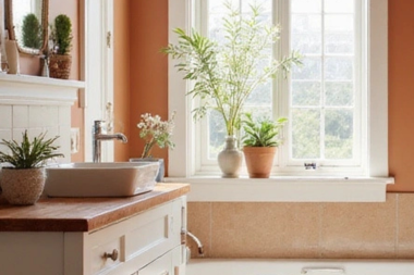
Inspired by Mediterranean landscapes and rustic charm, light terracotta brings warmth and subtle earthiness to a bathroom. Its soft, sunbaked tone works especially well in homes with natural wood accents, textured tile, or a warm, inviting palette. This color feels both grounded and fresh, making it a versatile choice for those looking to step outside the usual neutral tones.
Best For:
Guest bathrooms, Mediterranean-style homes, warm-toned spaces with wood or brass finishes.
How Not to Use It:
Avoid using light terracotta in bathrooms with lots of cool-toned materials like gray marble or stainless steel. The clash of warm and cool undertones can make the space feel visually off-balance. This color also works best with a matte or eggshell finish. Too much shine can wash out its earthy texture.
Our Favorite Light Terracottas:
Next Steps to Remodeling Your Bathroom
The color you choose for your bathroom sets the tone for how the space feels every single day.
From soft whites that open up small bathrooms to dramatic colors that add depth, there’s a paint color for every style and goal. Knowing how and where to use each one is the key to getting the most out of your design.
At Custom Built, our design team works closely with Michigan homeowners to select paint colors that elevate the look and feel of their remodel.
If you’re planning a bathroom remodel, schedule a Discovery Call with our team; we’ll help you take the next step toward a bathroom that feels beautifully personal and built to last.

Now that you know more about the top paint color ideas for your bathroom remodel, let’s explore the first step of your project with Custom Built, how much your bathroom will cost, and the factors that influence that final price:
- What is a Discovery Call with Custom Built? - This article details what your first call with Custom Built looks like as you start planning your remodel.
- How Much Does a Bathroom Remodel Cost in Lansing, Michigan? - Discover accurate price ranges for your potential bathroom remodeling project.
- 10 Factors That Affect the Cost of Bathroom Remodels - Learn more about the details that impact the cost of your bathroom remodel before you sign the dotted line.
Topics:


